We can interpret Decision Trees as a sequence of simple questions for our data, with yes/no answers. One starts at the root node, where the first question is asked. Based upon the answer, we navigate to one of two child nodes. Each child node asks an additional question, and based upon these answers we can move on to subsequent child nodes. This process stops at a terminal leaf node, where we get a final prediction out of the model. This algorithm is normally visualised as a branching flow chart that resembles an upside-down ‘tree’.
Table of Contents
What are Decision Trees?
Decision Trees are a family of non-parametric supervised learning models. They are based upon a sequence of simple boolean questions, termed ‘decision rules‘, that can be used to predict an outcome. Decision Trees can be applied to both classification and regression problems, and constitute some of the most popular machine learning algorithms used in industry. This popularity is due to the versatility, and explainability, of this algorithm.
In this post, we will focus strictly on CART. I covered the details of the CART Decision Tree algorithm in a previous article. With this approach, the input dataset is split into a series of subsets according to decision rules. This partitioning continues until some stopping criteria is met. The trees are comprised of connected nodes where binary decisions are made to define how the data are split. Data can be pictured as ‘flowing’ through the tree, passing from node to node, until a final partition of the data is reached. The node from which data flows from can be termed the parent, while the node to which data flows to is the child. There are 3 types of nodes:
- Root node: this is where all the data starts and where the initial decision rule is applied. This node has no parent.
- Interior nodes: these are the locations where decision rules are applied on data that come from the parent. The resulting partitioned data are then passed to the two child nodes.
- Leaf nodes: these nodes define the final partition of the data, and determine the ultimate output of the model. These nodes have no children.
We can illustrate this structure with a simple toy example. Let’s construct a Decision Tree to determine whether a vertebrate animal is a mammal or bird:
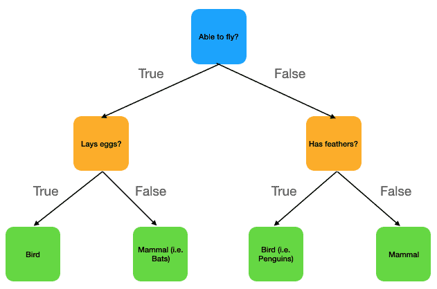
Figure 1: Simple depiction of a Decision Tree for distinguishing between mammals and birds. Nodes in the tree are indicated as coloured squares, with the colour-coding used to categorise root, interior, and leaf nodes. Each node contains a boolean question (i.e. decision rule). If the answer to this question is True, we move along the arrow to the left child node. Otherwise if the answer is False, we move along the arrow to the right child node. We always start at the root node, and work our way down to one of the leaf nodes. All possible prediction values are contained in the 4 leaf nodes at the bottom of the image.
This figure outlines a simple Decision Tree for determining between mammals and birds, based upon 3 decision rules:
- Ability to fly?
- Lays eggs?
- Has feathers?
The nodes are colour coded:
- Root node: blue
- Interior nodes: orange
- Leaf nodes: green
We start at the root node, and pass on to one of the interior nodes depending on how we answer the question “Able to fly?“. At this point, we need to answer the question in the interior node that we’ve arrived at. Depending on this answer, we can settle on one of the leaf nodes, and our final prediction.
As an example, let’s consider the case of using this model to determine whether a lion is a mammal or bird?

Starting at the root node, we move to the right child node since lion’s cannot fly. This brings us to the question: “Has feathers?“. Lion’s don’t have feathers, and so we move to the right child node again. Now we are in a leaf node, with the prediction label “mammal”. Therefore, our Decision Tree model classifies lion’s as mammals.
Some additional points to note:
- Nodes in the tree are linked via a logical AND relationship. Take our lion example: we arrived at the prediction “mammal” since lion’s cannot fly and do not have feathers.
- Decision Tree’s are excellent at capturing the interactions between different features in the data. Again looking at our lion example: we arrived at our final answer by combining two different characteristics (i.e. features) of the animal.
- Since CART is a greedy algorithm, the order in which the decision rules are asked is relevant. Looking at Figure 1, it was determined that asking “Able to fly?” at the start is the most optimal question for figuring out if a given animal is a mammal or bird. Bear in mind that this optimisation is local, with no knowledge of the following steps taken in the tree. Subsequent interior nodes follow the same greedy approach for local optimisation.
How to Interpret Decision Trees?
Trained Decision Trees can be interpreted as a type of flow chart for making predictions using input data. Looking at Figure 1, we can see at each step which question is being asked, and what the consequences of the answer are. This also informs us as to which features are used, and in what combinations, in order to make predictions. We can also get a sense for which features are most discriminating for our task by noting how early, or often, they are used in the sequence of decision rules in the tree.
Many Python packages include functionality for visualising a trained Decision Tree. These produce figures which include the exact decision rules used, the number of training samples allocated to each node, and the purity of said samples at each node.
These visualisations are fantastic tools for interpreting what exactly is happening inside the model. Within a single figure we can identify how predictions are made, in a way that the non-technical person can understand. They are ideal for presenting modelling results to project stakeholders.
Python Example
Here we will work through a simple example in Python to demonstrate how an actual Decision Tree can be visualised, and understood. We will work with the breast cancer dataset available from scikit-learn. As I have already analysed these data in my previous article on Logistic Regression, I won’t repeat that work here.
Setup
Let’s start by importing the necessary packages:
# imports
import pandas as pd
from sklearn.tree import DecisionTreeClassifier, plot_tree
from sklearn.model_selection import train_test_split
from sklearn.datasets import load_breast_cancer
import matplotlib.pyplot as plt
from sklearn.metrics import accuracy_score, precision_score, recall_score, f1_score
We can now prepare the data, perform a train-test split, and fit a Decision Tree classifier. Note that for the sake of simplicity, I am not performing any feature engineering prior to fitting the model. In addition, I will account for any class imbalance during the train-test split by making use of the stratify argument to train_test_split. The Decision Tree will be limited to a maximum depth of 2:
# load in the data
data = load_breast_cancer()

# isolate out the data we need
X             = data.data
y             = data.target
class_names   = data.target_names
feature_names = data.feature_names

# perform a train-test split
X_train, X_test, y_train, y_test = train_test_split(X, y, test_size=0.2, random_state=42, stratify=y)

# fit a decision tree classifier with max_depth=2
clf = DecisionTreeClassifier(max_depth=2, random_state=42)
clf.fit(X_train,y_train)
To verify that everything has worked during the preceding steps, let’s measure the performance of our trained classifier on our test set:
# compute performance on test set
y_pred = clf.predict(X_test)
print('accuracy score: %.2f' % accuracy_score(y_test,y_pred))
print('precision score: %.2f' % precision_score(y_test,y_pred))
print('recall score: %.2f' % recall_score(y_test,y_pred))
print('f1 score: %.2f' % f1_score(y_test,y_pred))
accuracy score: 0.89 precision score: 0.97 recall score: 0.86 f1 score: 0.91
The accuracy, precision, recall, and F1 scores indicate that our fitting procedure has worked. Also note that even with this small Decision Tree, we are already achieving some nice results!
Plot the Decision Tree Classifier
In order to get a better sense of the workings inside our classifier, let’s plot its structure using plot_tree:
# visualise the decision tree
fig = plt.figure(figsize=(14,8))
_ = plot_tree(clf,
              feature_names=feature_names,
              filled=True,
              class_names=class_names,
              fontsize=10)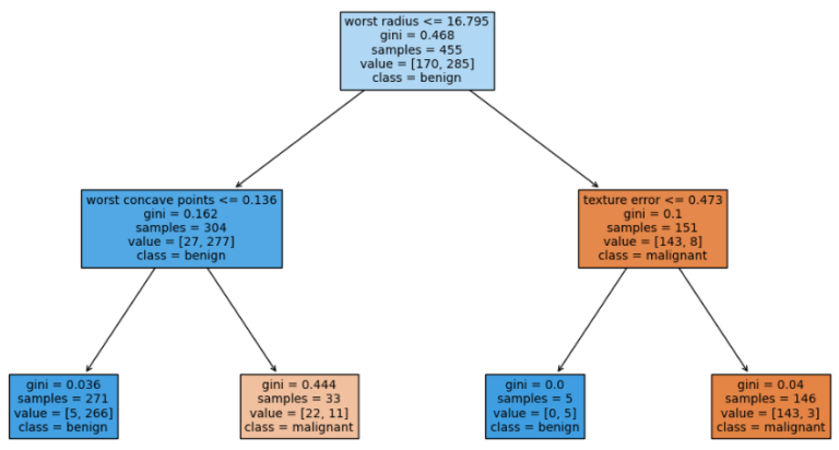
Figure 2: Visualisation of a trained Decision Tree Classifier. The classifier has been trained on the breast cancer dataset available from scikit-learn. The tree has been limited to a maximum depth of 2.
Figure 2 indicates the structure of the trained Decision Tree Classifier. Each square represents a node in the tree, with four leaf nodes at the bottom of the graph. The root and interior nodes show the decision rule, used to split incoming data, at the top of the square. Each square also includes the:
- Gini Impurity
- total number of samples
- number of samples per class
- dominant class for the subset of training data at the node
Note that the dominant class in the leaf nodes also represents the prediction outputs for the tree. The colour of the squares is indicative of the class purity at the node: blue stands for ‘benign’ whereas orange represents ‘malignant’. The darker the colour, the more pure the class is in the subset of training data at that node.
Feature Importances
I would like to quantify which features in our dataset are most relevant for classifying malignant/benign tissue. To do this, let’s make use of the .feature_importances_ attribute in the scikit-learn implementation:
# look at the feature importances
dfFeatures = pd.DataFrame({'Features':feature_names.tolist(),'Importances':clf.feature_importances_})
dfFeatures.sort_values(by='Importances',ascending=False).head(5)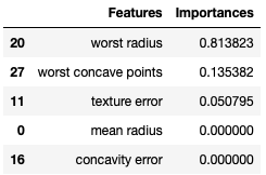
Figure 3: Feature importances for the trained Decision Tree Classifier, sorted in descending order.
Figure 3 displays the first five feature importances in descending order. The numerical values indicate the total normalised reduction in the Gini Impurity that is achieved by splitting on the associated feature throughout the tree. Not surprisingly ‘worst radius’, the feature used to split in the root node, has the highest importance. We can therefore conclude that ‘worst radius’, followed by ‘worst concave points’ and then ‘texture error’, are the most relevant features for determining whether a growth is malignant or not.
Note that there are only 3 features with non-zero feature importances. This is due to our Decision Tree being limited to a maximum depth of 2. As such, there are only 3 interior nodes in the tree.
Visualise Data Splits
To extend our examination further, we can plot how data is split according to the decision rules. I will do this in 2 steps: first we can plot how training data is allocated into the leaf nodes. Second, we can repeat this analysis for the held-out test set. Since the decision rules are obtained using the training data, we expect these plots to show a relatively good separation between the class labels. It would not be surprising to see some degradation in the quality of the split for the unseen test data.
Two plots will be required for our Decision Tree, one for each side of the tree. These will consist of scatter plots with worst radius versus worst concave points for the left-hand side (LHS), and worst radius versus texture error for the right-hand side (RHS).
We can start by writing a general function to produce each individual plot:
# function to plot one side of the Decision Tree
def plot_tree_side(dfNode: pd.DataFrame, feature: str, split_point: float, title: str) -> None:
    # obtain left and right leaf nodes
    dfLeftNode = dfNode[dfNode[feature]<=split_point].copy()
    dfRightNode = dfNode[dfNode[feature]>split_point].copy()
    # produce plot
    p1 = plt.scatter(dfLeftNode['worst radius'].values,dfLeftNode[feature],marker='o',color='blue')
    p2 = plt.scatter(dfRightNode['worst radius'].values,dfRightNode[feature],marker='^',color='red')
    plt.legend((p1,p2),('benign','malignant'))
    plt.hlines(split_point,xmin=dfNode['worst radius'].min(),xmax=dfNode['worst radius'].max(),color='green')
    plt.xlabel('worst radius')
    plt.ylabel(feature)
    plt.title(title)
    plt.show()
Now let’s package the train and test data into pandas dataframes:
# organise data into dataframes
dfTrain = pd.DataFrame(X_train,columns=feature_names)
dfTrain['label'] = y_train

dfTest = pd.DataFrame(X_test,columns=feature_names)
dfTest['label'] = y_test
Training Data
Let’s apply the decision rule in the root node to our training data. This will yield the subsets that are allocated to the LHS and RHS sides of the tree:
# split data according to root node
dfLHS = dfTrain[dfTrain['worst radius']<=16.795].copy()
dfRHS = dfTrain[dfTrain['worst radius']>16.795].copy()
Applying plot_tree_side to the LHS data will reveal how data is separated into the first 2 leaf nodes of the tree:
# plot LHS of tree
plot_tree_side(dfLHS,
               'worst concave points',
               0.136,
               'LHS of Decision Tree Classifier (worst radius <= 16.795)')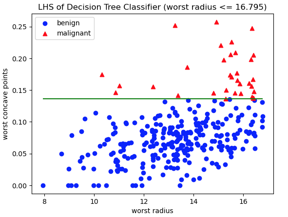
Figure 4: Scatter plot of training data, with class labels indicated. Red triangles represent malignant cases, whereas blue circles are benign. The axes represent the features worst radius and worst concave points: the two features used in decision rules on the LHS of the Decision Tree. The green horizontal line indicates the decision rule used to separate these data into the two LHS leaf nodes.
And we can repeat this step for the RHS data, to indicate how data is split into the last 2 leaf nodes:
# plot RHS of tree
plot_tree_side(dfRHS,
               'texture error',
               0.473,
               'RHS of Decision Tree Classifier (worst radius > 16.795)')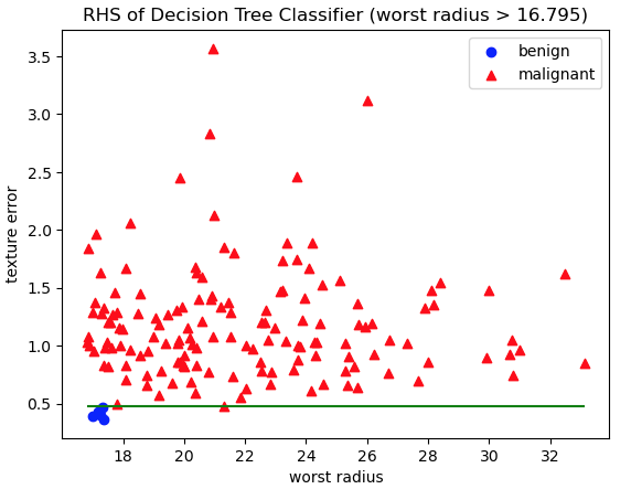
Figure 5: Scatter plot of training data, with class labels indicated. Red triangles represent malignant cases, whereas blue circles are benign. The axes represent the features worst radius and texture error: the two features used in decision rules on the RHS of the Decision Tree. The green horizontal line indicates the decision rule used to separate these data into the two RHS leaf nodes.
Figures 4 and 5 show how training data are split into the leaf nodes according to the decision rules. Plots like these are an excellent tool for visualising how the algorithm works, and verifying that the decision rules do in fact make sense. And Indeed, the separation of the data, indicated by the green horizontal lines, does appear to generally divide the two classes in the data.
Test Data
We can now apply the decision rule in the root node to our test data. This will yield the subsets that are allocated to the LHS and RHS sides of the tree:
# split data according to root node
dfLHS = dfTest[dfTest['worst radius']<=16.795].copy()
dfRHS = dfTest[dfTest['worst radius']>16.795].copy()
Applying plot_tree_side to the LHS data will reveal how data is separated into the first 2 leaf nodes of the tree:
# plot LHS of tree
plot_tree_side(dfLHS,
               'worst concave points',
               0.136,
               'LHS of Decision Tree Classifier (worst radius <= 16.795)')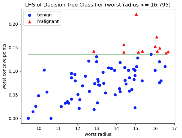
Figure 6: Scatter plot of test data, with class labels indicated. Red triangles represent malignant cases, whereas blue circles are benign. The axes represent the features worst radius and worst concave points: the two features used in decision rules on the LHS of the Decision Tree. The green horizontal line indicates the decision rule used to separate these data into the two LHS leaf nodes.
Again we can repeat this step for the RHS data, to indicate how data is split into the last 2 leaf nodes:
# plot RHS of tree
plot_tree_side(dfRHS,
               'texture error',
               0.473,
               'RHS of Decision Tree Classifier (worst radius > 16.795)')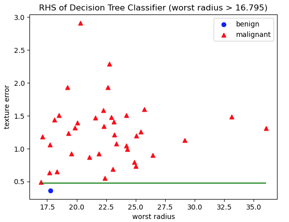
Figure 7: Scatter plot of test data, with class labels indicated. Red triangles represent malignant cases, whereas blue circles are benign. The axes represent the features worst radius and texture error: the two features used in decision rules on the RHS of the Decision Tree. The green horizontal line indicates the decision rule used to separate these data into the two RHS leaf nodes.
Figures 6 and 7 show how unseen test data are split into the leaf nodes according to the decision rules. Plots like these verify that our model works and is performative. The two classes are generally well separated by the decision rules learned during training.
Final Remarks
I hope this article has shed light on how we can interpret Decision Trees. There are various techniques and tools that can be used to understand how these algorithms work, and I have attempted to touch upon some of the main ones here. In this article you have learned:
- The components of CART Decision Trees
- How Decision Trees can be visualised as a kind of flow chart
- How to visualise the structure of the trained Decision Tree in Python
- What are the feature importances in a trained Decision Tree, and how to access them through the scikit-learn implementation
- How to visualise the splitting of data inside a Decision Tree
If you have any questions, comments, or suggestions regarding this article, please leave them below!
Related Posts
Hi I'm Michael Attard, a Data Scientist with a background in Astrophysics. I enjoy helping others on their journey to learn more about machine learning, and how it can be applied in industry.
you are so amazing with this very simple explanation of very complex concepts!
Thank you for the kind words!