This article will cover the Gini Impurity: what it is and how it is used. To make this discussion more concrete, we will then work through the implementation, and use, of the Gini Impurity in Python.
Table of Contents
What is the Gini Impurity?
The Gini Impurity is a loss function that describes the likelihood of misclassification for a single sample, according to the distribution of a certain set of labelled data. It is typically used within Decision Trees. More specifically, the Gini Impurity is used when training/growing a decision tree on a labelled training set. This metric can determine how best to split data at a given node in the tree, in order to create optimal child nodes. In general, a split that results in as little variation as possible, in the labels for each child node, is considered optimal.
This quantity is named after the statistician and sociologist Corrado Gini. It is the original splitting criteria used in CART. Many popular Python packages, such as scikit-learn and pyspark, include it as the default splitting criteria within their decision tree implementations.
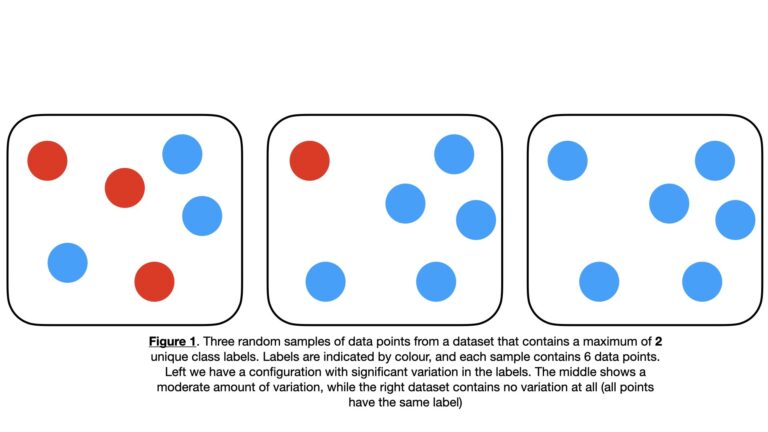
To make this explanation more concrete, let’s consider an example where we have a set of sample data points \bold{D} with \bold{C} = \{c_1, c_2, … c_n, … c_N \} unique label values. Some examples of possible \bold{D} configurations are illustrated below:
We can randomly select an individual entry \bold{d} from \bold{D}. The probability of selecting \bold{d} with a specific label c_n is given by p_{c_n} = P(c_n|\bold{D}).
We will now select two values from \bold{D} in succession, \bold{d}_1 and \bold{d}_2, with replacement. The question is, what is the probability of \bold{d}_1 and \bold{d}_2 having the same label c_n? The answer to this is:
p^2_{c_n} (1)
What is the probability of \bold{d}_1 and \bold{d}_2 having the same label across all possible labels \bold{C}? This is given by (1) marginalised over all \bold{C}:
\sum^N_{n=1} p^2_{c_n} (2)
It now follows from (2) that the probability of \bold{d}_1 and \bold{d}_2 not having the same label across all possible labels \bold{C} is given by:
G = 1 – \sum^N_{n=1}p^2_{c_n} (3)
Equation (3) describes the Gini Impurity. It can also be rewritten as:
G = \sum^N_{n=1}p_{c_n} – \sum^N_{n=1}p^2_{c_n}
G = \sum^N_{n=1}p_{c_n}(1 – p_{c_n}) (4)
We can plot the functional form of \bold{G} by noting that as a probability, p_{c_n} ranges from 0 to 1:
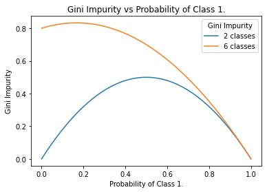
Figure 3. Functional form of the Gini Impurity for the 2-class and 6-class cases, as a function of p_{c_1}. Note that the left-hand side of the plot is computed with the maximum representation of all classes except c_1. In general, the more classes that are present, the closer the left-hand side, and maximum, will approach 1.0.
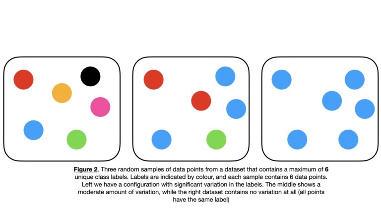
The Gini Impurity is a downward concave function of p_{c_n}, that has a minimum of 0 and a maximum that depends on the number of unique classes in the dataset. For the 2-class case, the maximum is 0.5. For the multi-class case the maximum G_{max} will be 1.0 > G_{max} > 0.5, where more classes will yield a larger maximum. An example of this is illustrated in Figure 2, where six unique classes are possible for each sample. In this scenario, the Gini Impurity reaches a maximum of around 0.83 (see Figure 3).
When G = 0, we have the situation that \bold{D} contains one unique label value \bold{C} = \{c\}. This is analogous to right-hand side images in Figure 1 & 2. Hence there is no chance in misidentifying a label for any individual entry in \bold{D}: they are all known to have the same unique label c. In other words, \bold{D} has the least “impurity”, or is “pure”.
When G = G_{max}, we have the maximum possible chance of obtaining two different class labels. For example, in the 2-class case shown in the left-side image of Figure 1, there a 50% chance of obtaining 2 different labels when selecting \bold{d}_1 and \bold{d}_2. In this situation, \bold{D} certainly contains multiple labels \bold{C} = \{c_1, …, c_N\}, and can be considered “impure”.
Python Examples
Let’s now apply what we’ve talked about already into a tangible example in Python. We can start by importing the necessary packages:
import numpy as np
import pandas as pd
import seaborn as sn
import matplotlib.pyplot as plt
from sklearn.datasets import make_classification
Our implementation of the Gini Impurity now follows:
## function that implements the gini impurity ##
def gini_impurity(Data: np.array) -> float:
    """
    Function to compute the Gini Impurity for a set of input data

    Inputs:
        Data => numpy 2D array of predictors & labels, where labels are assumed to be in the last column

    Outputs:
        G => gini impurity value
    """
    #initialize the output
    G = 0
    #iterate through the unique classes
    for c in np.unique(Data[:,-1]):
        #compute p for the current c
        p = Data[Data[:,-1]==c].shape[0]/Data.shape[0]
        #compute term for the current c
        G += p*(1-p)
    #return gini impurity
    return(G)
The dataset will be generated using the make_classification functionality available from scikit-learn. We can generate a dataset of 100 samples with a total of 5 predictive features. Of these features, 2 will be informative for identifying the associated class. The label column will contain a total of 2 unique classes:
## create a classification dataset ##
X,y = make_classification(n_samples=100,
                          n_features=5,
                          n_informative=2,
                          n_classes=2,
                          weights=[0.4,0.6],
                          random_state=42)
We can visualise these data to get a better sense of what we’ve generated. First let’s create a box plot of the predictive features:
## plot the distribution of the predictor features ##
plt.boxplot(X)
plt.xlabel('features')
plt.ylabel('values')
plt.title('Distributions in Features')
plt.xticks([1, 2, 3, 4, 5], ['x1', 'x2', 'x3', 'x4', 'x5'])
plt.show()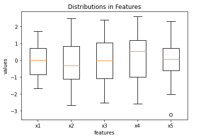
Three of the features (x1, x3, x5) possess medians that are approximately zero, the remaining two (x2 and x4) deviate from this somewhat. Outliers do not appear to be present in these data.
We can build a heat map of the predictive features, along with the label column. This can be used to reveal interesting correlations in our data:
## create a heatmap of the features & label ##
names   = ["x1","x2","x3","x4","x5"]
df      = pd.DataFrame(X,columns=names)
df["y"] = y
dfCor   = df.corr()
sn.heatmap(dfCor)
plt.title('Heat Map of Correlation Values')
plt.show()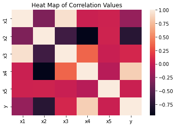
It’s clear from this figure that x2 and x4 are the most highly (anti-)correlated with the labels. We can therefore identify these features as the informative predictors specified when using make_classification earlier.
We’ll now illustrate the power of the Gini Impurity, by evaluating the quality of 2 different splits of data.
Random Split of the Data
Let’s make a random split of the available data, into two parts of 60% and 40% of the original dataframe. Remember for the 2-class problem, the closer to G \approx 0.5 we get, the more mixed the labels are in each dataframe. Therefore, the quality of the split will be poor. Conversely, the closer to G \approx 0.0, the more uniform the class labels are in each dataframe. As such, the quality of the split will be better.
## make a random 60%, 40% split of the data ##
df1 = df.sample(frac=0.4, random_state=42)
df2 = pd.merge(df,df1,indicator=True,how='outer').query('_merge=="left_only"') \
                                                 .drop('_merge', axis=1)
Now we can compute the Gini Impurity for each dataframe. Following this, we can calculate a weighted average to represent the overall split quality:
# compute the gini impurity for df1
gini_impurity(df1.values)
0.45499999999999996
# compute the gini impurity for df12
gini_impurity(df2.values)
0.4911111111111111
# weighted average to measure net 'quality' of the split
0.4*gini_impurity(df1.values) + 0.6*gini_impurity(df2.values)
0.4766666666666666
It’s quite evident that these Gini Impurities indicate poor quality splits. This makes sense: we don’t expect to get the labels of each class isolated into individual dataframes from a random split. Let’s see if we can improve upon this with a better splitting procedure.
Informed Split of the Data
We can try the same exercise as above again, but this time we’ll try to make a more informed choice on how we make our split. Let’s split based upon the median of x4, which we know is one of our informative features:
## make a split based upon the median of x4 ##
med = df.x4.median()
df1 = df[df.x4 > med].copy()
df2 = df[df.x4 <= med].copy()

# compute the gini impurity for df1
gini_impurity(df1.values)
0.03920000000000001
# compute the gini impurity for df12
gini_impurity(df2.values)
0.34319999999999995
# weighted average to measure net 'quality' of the split
(df1.shape[0]/df.shape[0])*gini_impurity(df1.values) + (df2.shape[0]/df.shape[0])*gini_impurity(df2.values)
0.19119999999999998
Even though our ‘informed’ splitting procedure is still rather crude, it has yielded an improvement over the previous results. The informed split produces a much lower Gini Impurity, which is what we would intuitively expect.
This process is automated within Decision Trees during the training process. At each node in the tree, a feature and split point are identified that minimises the weighted average Gini Impurity. These values are stored, and child nodes are created based upon the split of the training data they define.
Related Posts
Hi I'm Michael Attard, a Data Scientist with a background in Astrophysics. I enjoy helping others on their journey to learn more about machine learning, and how it can be applied in industry.