In this post, we will cover how to measure performance of a classification model. The methods discussed will involve both quantifiable metrics, and plotting techniques.

How do we Measure Performance of a Classification Model?

Classification is one of the most common tasks in machine learning. This is the case where the dependent variable only has discrete values. For example, imagine we have a dataset consisting of photos. Each photo is of a dog or a cat. As such, the task of assigning the label of ‘dog’ or ‘cat’ to each photo is a classification problem.  

I will cover 4 metrics commonly used to evaluate classification models. These include accuracy, precision, recall, and the F1 score. In addition, I will cover 2 plotting techniques that help visualise performance. They are the ROC and confusion matrix plots.

Before diving into the details, let’s define some terms that will be useful. For simplicity, consider the case where only two classes are present in some data, 0 and 1. Assume we have a trained classifier. Furthermore, assume some test data is available where we know the true classes:

  • True Positives (TP) are instances where the classifier predicts a 1, and the true value is 1
  • False Positives (FP) are instances where the classifier predicts a 1, and the true value is 0
  • False Negatives (FN) are instances where the classifier predicts a 0, and the true value is 1  
  • True Negatives (TN) are instances and the classifier predicts a 0, where the true value is 0

If you prefer video format, you can watch me describe the aforementioned evaluation methods here:

Accuracy

 Accuracy measures the fraction of correctly classified samples. The following equation defines this value:

Accuracy = \frac{TP + TN}{TP + FP + TN + FN}    (1)

Precision

Precision measures the ability of the classifier to correctly label positive values. The following equation defines this value:

Precision = \frac{TP}{TP + FP}    (2)

Recall

Recall measures the ability of the model to find all positive values. The following equation defines this value:

Recall = \frac{TP}{TP + FN}    (3)

F1 Score

The F1 score is a weighted average of the precision and recall metrics. The following equation defines this value:

F1 = \frac{2\times Precision \times Recall}{Precision + Recall}    (4)

Note that for all of the metrics above, the best possible outcome is 1.0. The worst possible result is a 0.0. Next let’s cover the two plotting techniques I mentioned earlier.

ROC plot

We can measure the diagnostic ability of a binary classifier by using the Receiver Operating Characteristic (ROC) plot. The raw output from a classifier are probabilities for each class in the dataset. We can determine the actual classes (‘0’ or ‘1’) by using a threshold value to convert these probabilities. Normally, this threshold is set to thres=0.5. Therefore, anything less than thres is assigned ‘0’, and the remainder are assigned ‘1’. For the ROC plot, the value of thres is varied between 0.0 and 1.0, and the performance of the model is illustrated in terms of the true positive rate (TPR) and false positive rate (FPR). Definitions for these quantities include:

TPR = \frac{TP}{TP+FN}    (5)

FPR = \frac{FP}{FP+TN}    (6)

Note that (5) is the same as the recall, whereas (6) is equivalent to another quantity called fallout.

Here is an example of the ROC plot I produced in the article on logistic regression:

Measure Performance of a Classification Model

The diagonal orange line indicates the result for predictions made at random. The blue curve illustrates the classifier result. The further above the blue line is from the diagonal, the better the model is performing. A perfect classifier would be a single blue point in the upper left corner (TPR = 1.0 and FPR = 0.0). A blue curve dipping below the orange diagonal would indicate a model performing worse than random guessing!

The US military developed the ROC plot for operators of military radar receivers, during World War II.

Confusion Matrix

A confusion matrix is a tabular illustration of the TP, FP, TN, and FN counts. It is possible to make these types of plots for datasets with any number of classes present. Below is an example of the 2-class confusion matrix:

Measure Performance of a Classification Model

True classes are indicated on the left vertical. Predicted classes are on the bottom horizontal. A perfect classifier would have all counts on the diagonal, and zeros everywhere else.

Python Coding Examples

In this section we will work in Python to demonstrate how to measure performance of a classification model. First let’s import the necessary packages:

## imports ##
import numpy as np
from sklearn.datasets import make_classification
from sklearn.metrics import accuracy_score, precision_score, recall_score, f1_score, roc_curve, plot_confusion_matrix
import matplotlib.pyplot as plt
from sklearn.tree import DecisionTreeClassifier
from sklearn.model_selection import train_test_split

Notice that I’m making heavy use of the scikit-learn module.  Next let’s use the make_classification function to generate some data:

## create dataset ##
X,y = make_classification(n_samples=1000, 
                          n_features=20, 
                          n_informative=5, 
                          n_redundant=2, 
                          n_classes=2, 
                          random_state=42)

A total of 1000 samples are generated, with 20 features in the matrix \bold{X}. Of these features, only 5 are informative, and therefore useful for modelling. Another 2 features are redundant, meaning these are linear combinations of the informative features. The vector of labels y contains 2 classes.

Our next step is to separate the data into train and test sets. Therefore, we can use the train_test_split function:

## do a train-test split ##
X_train, X_test, y_train, y_test = train_test_split(X, y, test_size=0.2, random_state=42)

Twenty percent of the data is allocated for testing. The remaining 80% will be used to train our model. Our model here is a decision tree classifier, which does not require feature scaling. Therefore, let’s proceed to train the model:

## declare and fit a classifier ##
tree = DecisionTreeClassifier()
tree.fit(X_train,y_train)

Now we can generate predictions with our trained classifier on the test dataset. Furthermore, we can evaluate the performance of the model using metrics (1), (2), (3), and (4). We will make use of the functionality available through scikit-learn:

## obtain predictions & measure performance ##
y_pred = tree.predict(X_test)
acc    = accuracy_score(y_test,y_pred)
pre    = precision_score(y_test,y_pred)
rec    = recall_score(y_test,y_pred)
f1s    = f1_score(y_test,y_pred)
print("Accuracy score: %.2f" % acc)
print("Precision score: %.2f" % pre)
print("Recall score: %.2f" % rec)
print("F1 score: %.2f" % f1s)

Accuracy score: 0.92

Precision score: 0.95

Recall score: 0.88

F1 score: 0.91

The classifier is functioning well, considering we performed no hyperparameter tuning. The decision tree does a very good job at correctly identifying the ‘1’ classes (precision), at the expense of finding all of them (recall). The overall score (accuracy/f1) is quite reasonable.

Finally, we can visualise our results by making a confusion matrix and ROC plots:

## produce a confusion matrix ##
plot_confusion_matrix(tree, X_test, y_test)  
plt.show() 
Measure Performance of a Classification Model
## produce a ROC plot ##
#obtain prediction probabilities
y_prob = tree.predict_proba(X_test)
#calculate false & true positive rates
fpr,tpr,_ = roc_curve(y_test, y_prob[:,1])
#construct plot
plt.plot(fpr,tpr)
plt.title('Receiver Operating Characteristic')
plt.plot([0, 1], ls="--")
plt.plot([0, 0], [1, 0] , c=".8"), plt.plot([1, 1] , c=".8")
plt.ylabel('True Positive Rate')
plt.xlabel('False Positive Rate')
plt.show()
Measure Performance of a Classification Model

These plots demonstrate reasonably good results, consistent with the scores we calculated earlier. Next steps could include the following two approaches. First, we could try out different classification models. Second, we could perform hyperparameter tuning to optimise any given model.

Related Posts

5 1 vote
Article Rating
Subscribe
Notify of
guest

1 Comment
Oldest
Newest Most Voted
Inline Feedbacks
View all comments
trackback

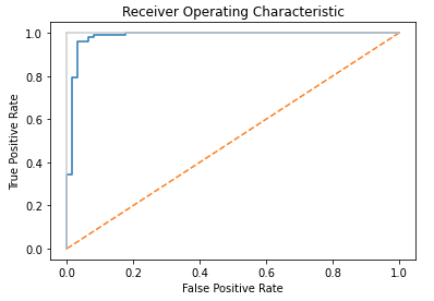
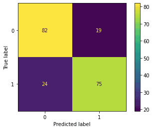
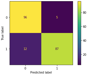
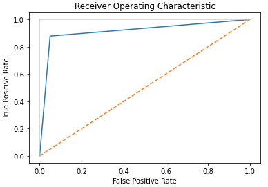
[…] Now let’s test the performance of our pipeline, using standard measures of performance for a classifier: […]

1
0
Would love your thoughts, please comment.x
()
x
Newsletter Signup