In this post, we will examine Principal Component Analysis (PCA), and build a PCA machine learning model in Python. We will then proceed with an example: to apply PCA to the task of stock portfolio analysis.
Table of Contents
Motivation: Why do PCA?
In this post, we will examine Principal Component Analysis (PCA), and build a PCA machine learning model in Python. We will then proceed with an example: to apply PCA to the task of stock portfolio analysis. PCA is a popular technique for doing dimensionality reduction, or in other words, data-compression. The desired outcome is a data set with fewer features, but contains approximately the same information content as the original data. There are a number of reasons why we would want to compress our data:
- Reduce the computational resources required to handle the data
- Ease the ability to visualise interesting dynamics
- Improve performance of machine learning models, by combating the ‘curse of dimensionality’1
- Reveal a reduced set of interesting features, from the set of raw input data
PCA is an unsupervised algorithm, in that it does not use or require labels in the training data. It was developed in 1901 by Karl Pearson2 and 1933 by Harold Hotelling3.
Assumptions and Considerations
There are a number of key assumptions that we will make when working with PCA. These include:
- All data involved follow a normal distribution. This implies that the mean and variance are sufficient statistics to describe the data
- There is a high signal-to-noise (SNR) ratio in the measured data. Variance observed in the data should be primarily due to the ‘source’ we are trying to measure
- The problem being tackled is linear in nature, and the coordinate system used is orthogonal. This permits the application of linear algebra
Derivation of the PCA Algorithm
In the course of researching for this article, I found an excellent paper explaining PCA by Jonathon Shlens. This document also provides two derivations for the algorithm: the first focusing on diagonalising the covariance matrix of the data set, while the second makes use of Single Value Decomposition (SVD). While the latter approach is more general, and is often used in PCA implementations, here I will focus on the first. The reasons for this include it’s mathematical simplicity, and relatability to physical processes people can visualise.
We will begin with a simple example, to help illustrate the derivation covered in this section. Imagine a table on which a mass \bold{m} is free to move. The mass is attached to a spring that allows movement along a single linear direction. This setup is visualised below:
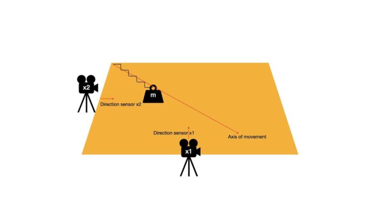
The axis of movement defines the line along which the mass \bold{m} is oscillating. There are two sensors, \bold{x1} and \bold{x2}, that are placed on perpendicular slides of the table. The direction these sensors are pointed are also indicated in the image above. As \bold{m} moves back and forth on the table surface, \bold{x1} and \bold{x2} measure the displacement of the mass along their respective lines of sight.
If we create a scatter plot of the recordings from \bold{x1} and \bold{x2}, we will get something like this:
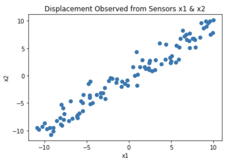
Note that the coordinate system reflects the fact that (0,0) is in the centre of the table. We can see from this plot that most of the variance in the data lies along the diagonal from the lower left to upper right. In fact this corresponds to the axis of movement for the mass \bold{m}. The scatter in the data points, that is perpendicular to this axis, is caused by measurement noise.
The data set comprised of the displacement measurements from sensors \bold{x1} and \bold{x2} can be represented in the following matrix:
\bold{X} = \begin{bmatrix} x_{1,1} & x_{1,2} & … & x_{1,n} \\ x_{2,1} & x_{2,2} & … & x_{2,n} \end{bmatrix} (1)
The first and second rows record measurements from \bold{x1} and \bold{x2}, respectively. There are a total of n measurements from these sensors, represented by the columns of \bold{X}.
We can ask ourselves an interesting question: do we really need to have two rows in \bold{X}? In other words, do we really need to have two sensors to fully describe the movement of the mass? After all, the movement of \bold{m} is along a straight line. Using a single sensor, which is situated to measure displacements along the axis of movement, should be adequate to do the job.
Often in real projects, we do not know in advance what would be the optimal configuration for our data collection devices. All that is available is a raw dataset from which we would like to yield insights. As such, we would like to derive a algorithm by which we can:
- align our coordinate system to emphasis the signal in the data
- remove redundancy in our data
Looking back at our example, the outcome of the algorithm we want is equivalent to the following:
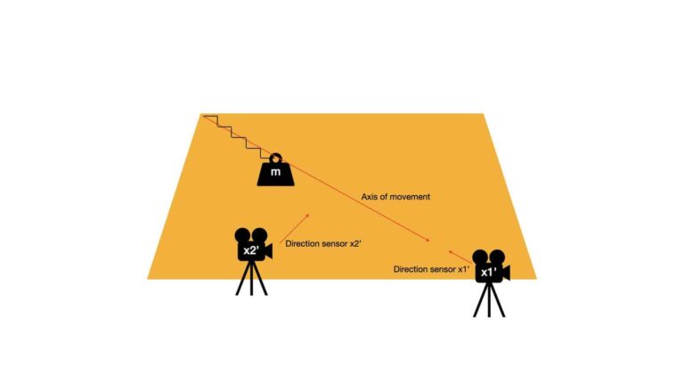
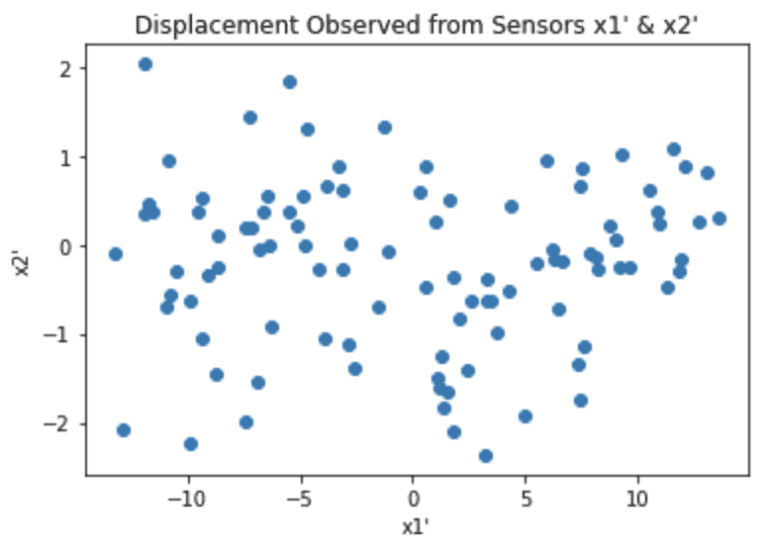
Notice now all the interesting dynamics is measured by sensor \bold{x1'}, which is positioned to have a line-of-sight that is the same as the axis of movement for \bold{m}. By contrast, sensor \bold{x2'} only measures noise. As such, to describe the system we only need to keep the measurements from sensor \bold{x1'}:
\bold{X'} = \begin{bmatrix} x'_{1,1} & x'_{1,2} & … & x'_{1,n} \\ x'_{2,1} & x'_{2,2} & … & x'_{2,n} \end{bmatrix} \approx \begin{bmatrix} x'_{1,1} & x'_{1,2} & … & x'_{1,n} \end{bmatrix} (2)
Therefore, the task we are trying to solve involves finding a rotational transformation \bold{P} such that:
\bold{X'} = \bold{PX} (3)
How should we go about finding \bold{P}? We will assume \bold{P} is orthonormal. One way is to look at the covariance matrix of \bold{X'}:
\bold{C_{X'}} = \frac{1}{n-1}\bold{X'}\bold{X'}^T (4)
For for the properties we expect to see in \bold{X'}, \bold{C_{X'}} should be diagonal. This would imply there is no redundancy in the data, and that the basis vectors for the new coordinates are aligned with the dynamics of the system. In our example, the basis vectors correspond to the directions of the two sensors.
Let’s now combine (3) and (4):
\bold{C_{X'}} = \frac{1}{n-1}\bold{X'}\bold{X'}^T
\bold{C_{X'}} = \frac{1}{n-1}\bold{PX}(\bold{PX})^T
\bold{C_{X'}} = \frac{1}{n-1}\bold{PX}\bold{X}^T\bold{P}^T
\bold{C_{X'}} = \frac{1}{n-1}\bold{P}\bold{S}\bold{P}^T (5)
Note that \bold{S} = \bold{XX}^T. It turns out that \bold{S} is a symmetric matrix, and as such it is diagonalised by an orthogonal matrix of its eigenvectors (see theorems 2, 3, and 4 in the appendix of Shlens, J. 2005). As such we can write:
\bold{S} = \bold{EDE}^T (6)
where \bold{D} is a diagonal matrix, and \bold{E} is a matrix with columns composed of the eigenvectors of \bold{S}.
Here I will take it for granted that the rank of \bold{S} is the same as the number of rows in this matrix (i.e. \bold{S} is not degenerate). In this case, there will be the same number of eigenvectors as there are rows in \bold{S}.
Now let’s set:
\bold{P} = \bold{E}^T (7)
We can plug (7) into (6) to yield \bold{S} = \bold{P}^T\bold{DP}. This final result can be inserted into (5) to give us:
\bold{C_{X'}} = \frac{1}{n-1}\bold{P}(\bold{P}^T\bold{DP})\bold{P}^T (8)
For an orthogonal matrix, its inverse is equal to its transpose (see theorem 1 in the appendix of Shlens, J. 2005). As such, \bold{P}^T = \bold{P}^{-1} and we have:
\bold{C_{X'}} = \frac{1}{n-1}\bold{P}(\bold{P}^{-1}\bold{DP})\bold{P}^{-1}
\bold{C_{X'}} = \frac{1}{n-1}(\bold{P}\bold{P}^{-1})\bold{D}(\bold{PP}^{-1})
\bold{C_{X'}} = \frac{1}{n-1}\bold{D} (9)
It is evident from (9) that our choice of \bold{P}, defined by (7), has led to a diagonal covariance matrix for \bold{X'}. The rows of \bold{P} are our principal components, in that they define a basis onto which the values in \bold{X} are projected to yield \bold{X'}.
The work above made no assumptions specific to the particular setup described at the beginning of this section. We could have had 3 sensors, 4 sensors, etc. and our analysis would still hold. Therefore, a general algorithm to do PCA is as follows:
- Centre the data, by removing the mean from each feature in \bold{X}4
- Calculate the eigenvectors of \bold{S} = \bold{XX}^T
- Project our data onto the new basis according to equation (3)
Implementation of a PCA Machine Learning Model in Python
Here we will encapsulate the algorithm, covered in the previous section, into a single Python class. The required packages for this class to work include numpy and typing. We will begin with the class definition, initialiser, and destructor functions:
#class that encapsulates the PCA model
class PCA(object):
    #initialiser function
    def __init__(self,n_components : int = 0) -> None:
        self.n_components = n_components
        self.e_val        = np.array([])
        self.e_vec        = np.array([])
        self.col_idx      = np.array([])

    #destructor
    def __del__(self) -> None:
        del self.n_components
        del self.e_val
        del self.e_vec
del self.col_idx- __init__(self,n_components) : This is an initialiser function that is called whenever a class instance is created. The integer argument, n_components, specifies the number of features to keep after the transformation of the data into principal component space. If this argument is left at 0, all the features are kept.
- __del__(self) : This is the destructor function that is called whenever a class instance is deleted. It cleans up the resources of the instance.
    #public function to train the model
    def fit(self, X_train : np.array) -> None:
        #since I'm assuming the input matrix X_train has shape (samples,features), compute the transpose
        X = np.transpose(X_train)
        #remove the mean from each feature
        X -= np.mean(X,axis=1).reshape(-1,1)
        #compute the covariance matrix of X
        C = np.matmul(X,np.transpose(X))
        #find the eigenvalues & eigenvectors of the covariance
        self.e_val,self.e_vec = np.linalg.eig(C)
        #sort the negated eigenvalues (to get sort in decending order)
        self.col_idx = np.argsort(-self.e_val)
- fit(self,X_train) : A public function used to train the PCA model. The input argument X_train is a numpy array containing the input data required to compute the eigenvectors. Steps (1) and (2), from the end of the previous section, are done here.
    #public function to transform the dataset
    def transform(self, X) -> np.array:
        #check that the model has been trained?
        if self.e_val.size and self.e_vec.size and self.col_idx.size:
            #since I'm assuming the input matrix X_train has shape (samples,features), compute the transpose
            X = np.transpose(X)
            #project data onto the PCs
            X_new = np.matmul(np.transpose(self.e_vec),X)
            #transform back via tranpose + sort by variance explained
            X_new = np.transpose(X_new)
            X_new = X_new[:,self.col_idx]
            #if n_components was specified, return only this number of features back
            if self.n_components != 0:
                X_new = X_new[:,:self.n_components]
            #return
            return(X_new)
        else:
            print('Empty eigenvectors and eigenvalues, did you forget to train the model?')
            return(np.array([]))
- transform(self,X) : This is another public function which transforms the input data X onto principal component space. The returned array contains the number of components specified when creating the instance, ordered by variance explained. This function will only work for trained models.
    #public function to return % explained variance per PC
    def explained_variance_ratio(self) -> np.array:
        #check that the model has been trained?
        if self.e_val.size and self.col_idx.size:
            #compute the sorted % explained variances
            perc = self.e_val[self.col_idx]
            perc = perc/np.sum(perc)
            #if n_components was specified, return only this number of features back
            if self.n_components != 0:
                perc = perc[:self.n_components]
            #return
            return(perc)
        else:
            print('Empty eigenvalues, did you forget to train the model?')
            return(np.array([]))
- explained_variance_ratio(self) : The percentage variance, explained by each principal component, is returned when calling this public function. The number of components returned is specified by the programmer when creating the instance.
    #public function to return the eigenvalues & eigenvectors
    def return_eigen_vectors_values(self) -> Tuple[np.array,np.array]:
        #check that the model has been trained?
        if self.e_val.size and self.e_vec.size and self.col_idx.size:
            #sort the eigenvalues and eigenvectors
            e_val = self.e_val[self.col_idx]
            e_vec = self.e_vec[:,self.col_idx]
            #if n_components was specified, return only this number of features back
            if self.n_components != 0:
                e_val = e_val[:self.n_components]
                e_vec = e_vec[:,:self.n_components]
            #return
            return(e_vec,e_val)
        else:
            print('Empty eigenvalues & eigenvectors, did you forget to train the model?')
return(np.array([]),np.array([]))- return_eigen_vectors_values(self) : This is the final function for this class. This public function can be called to return a tuple containing the eigenvectors and eigenvalues that result from fitting the model. Like the previous functions, the number of components returned is determined by the programmer when initialising the instance.
Build a PCA Machine Learning Model for Stock Portfolio Analysis
Disclaimer: the techniques presented here are for educational purposes only. This section in no way represents investment advice.
Objective
We will now apply PCA to a real world problem: stock portfolio analysis. Our aim will be to develop a model that can:
- be used to identify anomalously large changes in the adjusted close prices of the constituent portfolio stocks
- facilitate the development of simple visualisations that can be easily interpreted by an analyst
Let’s start by importing all the required packages:
## imports ##
import yfinance as yf
import numpy as np
import pandas as pd
import matplotlib.pyplot as plt
from sklearn.preprocessing import StandardScaler
import math
import statsmodels.api as sm
import scipy.stats as stats
import mpl_axes_aligner
from typing import Dict,Tuple
Next we can define a couple of helper functions that will aide in our analysis:
#function to produce biplot
def biplot(dfScores: pd.DataFrame, dfLoadings: pd.DataFrame) -> None:

    #create figure and axis objects
    fig,ax = plt.subplots(figsize=(15,8))

    #make a scores plot
    ax.scatter(dfScores.PC1.values,dfScores.PC2.values, color='b')
    #set x-axis label
    ax.set_xlabel("PC1",fontsize=10)
    #set y-axis label
    ax.set_ylabel("PC2",fontsize=10)

    #create a second set of axes
    ax2 = ax.twinx().twiny()

    #make a loadings plot
    for col in dfLoadings.columns.values:
        #where do our loading vectors end?
        tipx = dfLoadings.loc['PC1',col]
        tipy = dfLoadings.loc['PC2',col]
        #draw the vector, and write label text for col
        ax2.arrow(0, 0, tipx, tipy, color = 'r', alpha = 0.5)
        ax2.text(tipx*1.05, tipy*1.05, col, color = 'g', ha = 'center', va = 'center')

    #align x = 0 of ax and ax2 with the center of figure
    mpl_axes_aligner.align.xaxes(ax, 0, ax2, 0, 0.5)
    #align y = 0 of ax and ax2 with the center of figure
    mpl_axes_aligner.align.yaxes(ax, 0, ax2, 0, 0.5)

    #show plot
    plt.show()

#Function to check  whether the point (x,y) is outside the ellipse defined by (u,v,a,b)
def outside_ellipse(x, y, u, v, a, b):

    #checking the equation of ellipse with the given point
    p = ((x-u)/a)**2 + ((y-v)/b)**2

    #convert output to boolean (True if outside the ellipse)
    p = p > 1

    return(p)
- biplot(dfScores, dfLoadings) : this function can be used to produce a Biplot of the PCA fitting results. The plot consists of 2 parts: i) a scores plot that shows the data points for the first two principal components and ii) a loadings plot that illustrates the eigenvectors for each constituent stock. The closer the eigenvectors are positioned to each other, the more similar the stocks are (in terms of their adjusted close price volatility).
- outside_ellipse(x, y, u, v, a, b) : we can use this function to determine if a point (x,y) lies inside an ellipse with a centroid (u,v) and major and minor axes (a,b). Returns True if (x,y) is outside the ellipse.
Load Data and Preprocessing
Now we will load in the relevant stock movement data from yahoo finance. I will make use of the yfinance Python package in order to accomplish this:
#read in data from yahoo
stocks = "AAPL MSFT AMZN FB GOOG NVDA FIS AMD TDC HUBS FTNT ASML INTC IBM ORCL CSCO " \
         "SONY HTHIY TCEHY PCRFY LNVGY"
dfData = yf.download(stocks, start="2015-01-01", end="2021-10-01")
These data consist of the price movements for 21 different technology stocks, between the time period 2015-01-01 to 2021-10-01. We will use these data to build a PCA model.
At this point we can work through the data preparation. The steps we will proceed with include:
- Isolate the adjusted close prices only
- Calculate the daily percent changes, and remove any null values present
- Scale the data, so that each stock has a mean of 0 and a standard deviation of 1
Let’s start with point 1 and visualise the adjusted close prices:
#extract out adjusted close prices
dfClose = dfData['Adj Close'].copy()

#plot the adjusted close prices
dfClose.plot(figsize=(18,12))
plt.show()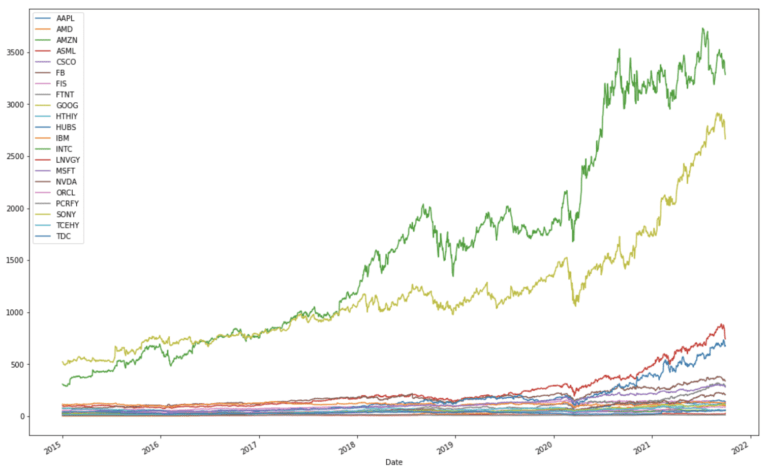
It is apparent that there is a wide range in scale with these historical stock prices. We can now use the pandas built-in function to compute the percentage change in daily adjusted close prices:
#compute differences in close prices
dfClose = dfClose.pct_change().dropna()

#plot the differenced close prices
dfClose.plot(figsize=(18,12))
plt.show()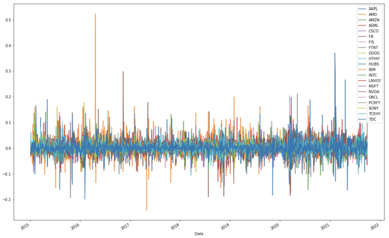
Expressed in this way, the close price data now appears to be more standardised, in the sense that autocorrelations have been removed. To be certain that the data are standardised, I will scale each stock to have a mean of 0 and standard deviation of 1:
#standardise data set
scaler = StandardScaler()
closes = scaler.fit_transform(dfClose)
dfClose = pd.DataFrame(closes,columns=dfClose.columns)
We can now visualise the result:
#plot the standardised close price differences
dfClose.plot(figsize=(18,12))
plt.show()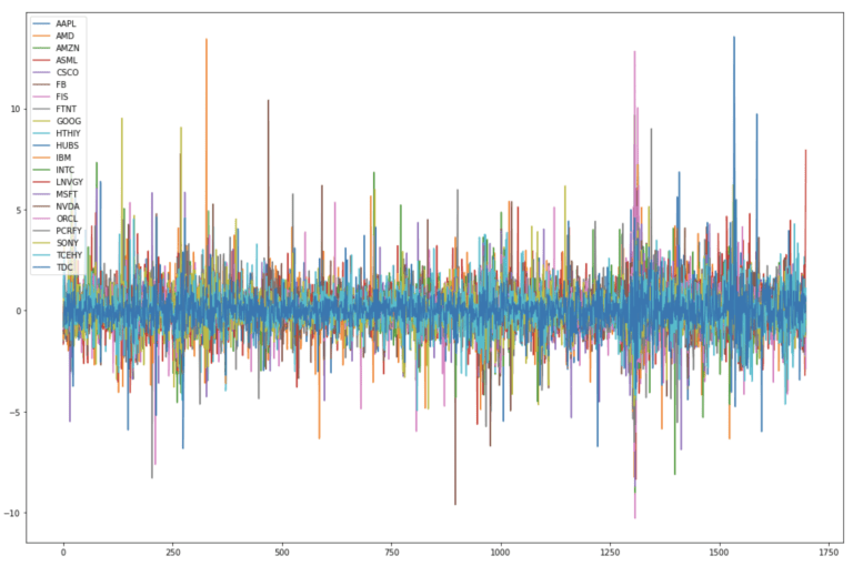
We now have a standardised dataset where the variations in each stock price are on the same scale. These data can now be described with a set of constant statistics (mean & standard deviation) in time. As such they are now amenable to PCA.
Checking Assumptions: Quantile-Quantile Plots
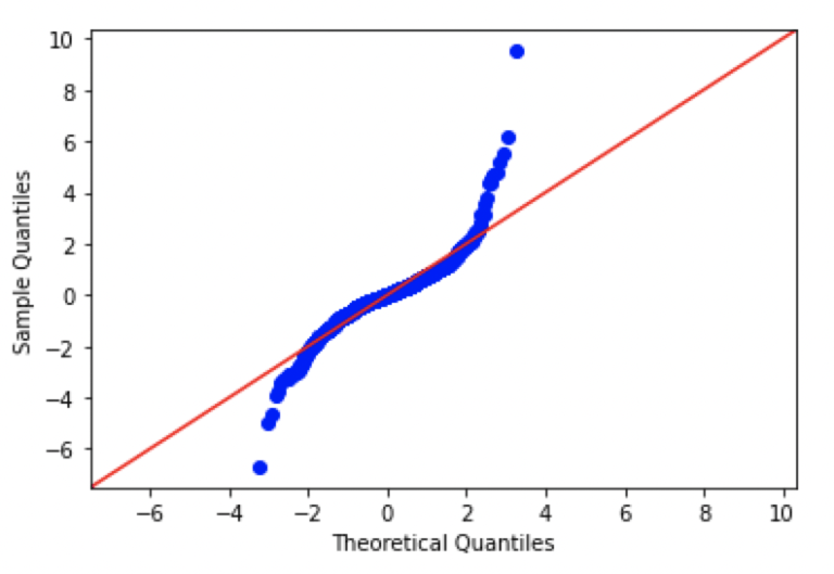
This would be a good point to check one of our assumptions, namely whether our data is normally distributed or not? To accomplish this, we will produce Quantile – Quantile plots (QQ plots) for a subsample of stocks in the portfolio. This won’t be an exhaustive check, but we will get a sense for how closely the data follows this assumption.
QQ plots compare the actual observations, in terms of quantiles, with what would be expected from a theoretical distribution. Typically, the theoretical distribution is represented by a straight 45 degree diagonal line, while the observations are illustrated as a scatter plot. The more the observations deviate from the diagonal, the more we can say that the data are not consistent with this type of distribution.
We can produce QQ plots in Python by making use of the API available through the statsmodels package. Let’s make plots for AAPL, AMZN, GOOG, and FB:
#create Q-Q plot with 45-degree line added to plot AAPL
fig = sm.qqplot(dfClose.AAPL.values, dist=stats.norm, loc=0, scale=1, line='45')
plt.show()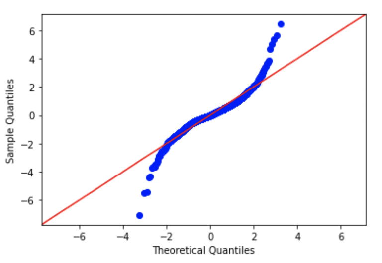
#create Q-Q plot with 45-degree line added to plot AMZN
fig = sm.qqplot(dfClose.AMZN.values, dist=stats.norm, loc=0, scale=1, line='45')
plt.show()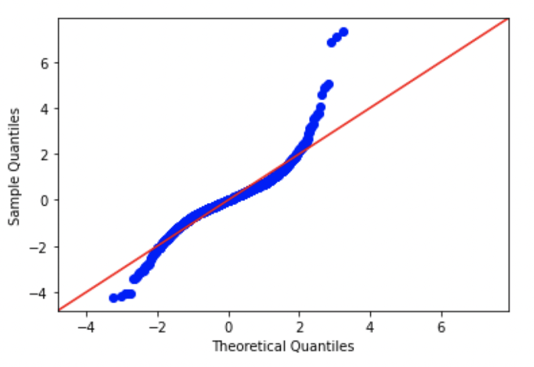
#create Q-Q plot with 45-degree line added to plot GOOG
fig = sm.qqplot(dfClose.GOOG.values, dist=stats.norm, loc=0, scale=1, line='45')
plt.show()
#create Q-Q plot with 45-degree line added to plot FB
fig = sm.qqplot(dfClose.FB.values, dist=stats.norm, loc=0, scale=1, line='45')
plt.show()
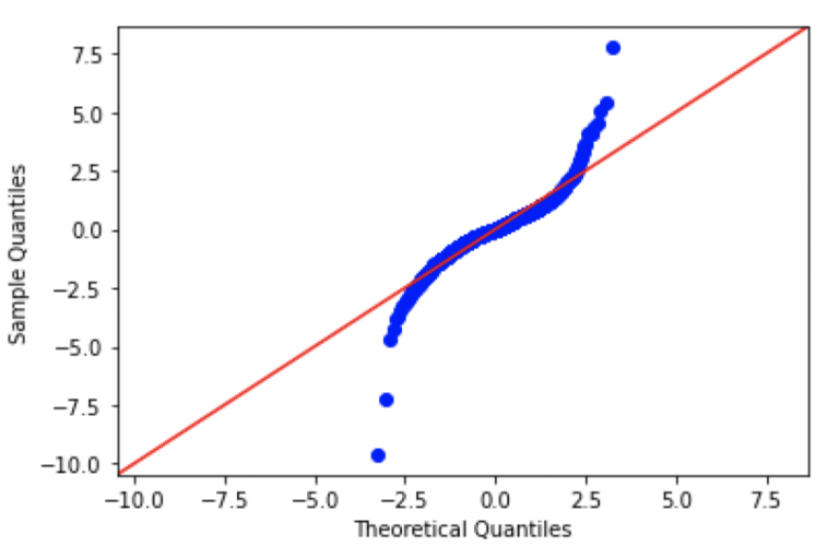
Looking at these plots, we can see that there are significant differences from normal in each of the plots. In fact, the patterns seen here are consistent with data distributions that have ‘fat tails’, in comparison to a standard normal distribution.
Despite this deviation from our assumptions, we will continue with our analysis to see what results we can obtain with PCA. It is important to keep in mind that we are not working in a perfectly ideal setup. However, in real world projects, such deviations can be quite common.
Training the PCA Machine Learning Model
Here we can start by building a PCA model using the class defined earlier:
#fit the PCA model and transform the data
pca_custom = PCA()
pca_custom.fit(closes)
pcs = pca_custom.transform(closes)
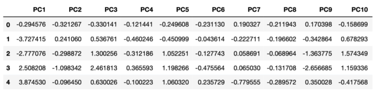
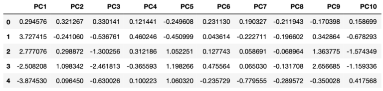
dfPCs1 = pd.DataFrame(pcs,columns=['PC'+str(i) for i in range(1,dfClose.shape[1]+1)])The transformed data is stored inside the dfPCs1 dataframe. The contents of this dataframe can easily be sampled and visualised (here for the first 10 principal components):
Let’s plot how much variance is explained by each resulting principal component:
#how much variance is explained by each pc?
f, ax = plt.subplots(figsize=(18,5))
plt.bar(['PC'+str(i) for i in range(1,22)],pca_custom.explained_variance_ratio())
plt.ylabel('Explained Variance Ratio')
plt.xlabel('Principal Components')
plt.title('Explained Variance per PC - Custom PCA Model')
plt.show()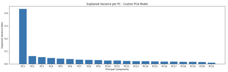
These results look good, with a decrease in explained variance with each successive principal component. The first principal component covers just over 40% of all the variance seen in the portfolio.
We can now compare these results with the PCA implementation available from scikit-learn:
#import scikit-learn PCA
from sklearn.decomposition import PCA

#fit the PCA model and transform the data
pca    = PCA()
pcs    = pca.fit_transform(closes)
dfPCs2 = pd.DataFrame(pcs,columns=['PC'+str(i) for i in range(1,dfClose.shape[1]+1)])
The transformed data is stored inside the dfPCs2 dataframe. Like before, the contents of this dataframe can be sampled and visualised (for the first 10 principal components):
And we can produce a bar plot of the explained variance per principal component:
#how much variance is explained by each pc?
f, ax = plt.subplots(figsize=(18,5))
plt.bar(['PC'+str(i) for i in range(1,22)],pca.explained_variance_ratio_)
plt.ylabel('Explained Variance Ratio')
plt.xlabel('Principal Components')
plt.title('Explained Variance per PC - Sklearn PCA Model')
plt.show()
The explained variance plots are identical for both the scikit-learn and custom-build PCA models. However, the transformed values appear to have some signs flipped. We can check this more thoroughly using builtin numpy functionality:
#check if our two outputs are equal?
np.allclose(dfPCs1,dfPCs2)
False
#... ok what if we just compare the absolute values?
np.allclose(np.absolute(dfPCs1),np.absolute(dfPCs2))
True
It is apparent from these results that although the outcomes from the two PCA models have the same absolute values, the signs are flipped for some entries. In fact, the two models are equivalent. The scikit-learn PCA implementation makes use of Single Value Decomposition (SVD), where both signed versions of the eigenvectors form a valid solution.
Modelling Results
Now we can take a closer look at the results from PCA. Since the two models trained previously are equivalent, we could use either. I will choose to make use of the scikit-learn results below.
First let’s extract the eigenvectors from our trained model, for use later:
#extract out our eigenvectors from the trained model
dfLoadings = pd.DataFrame(pca.components_,columns=dfClose.columns,index=dfPCs2.columns)
Let’s visualise the first three principal components to see what our transformed data looks like:
#plot just the first 3 PCs
dfPCs2[['PC1','PC2','PC3']].plot(figsize=(18,12))
plt.show()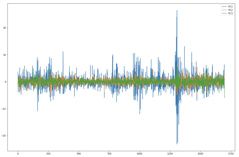
Here it’s clear to see that each successive principal component contains less variance. By far the largest movements are seen in PC1, whereas PC2 and PC3 are much less volatile. These results are consistent with the explained variance bar plots we produced earlier.
We can now make use of the biplot helper function to provide a different perspective on our results:
#produce biplot
biplot(dfPCs2, dfLoadings)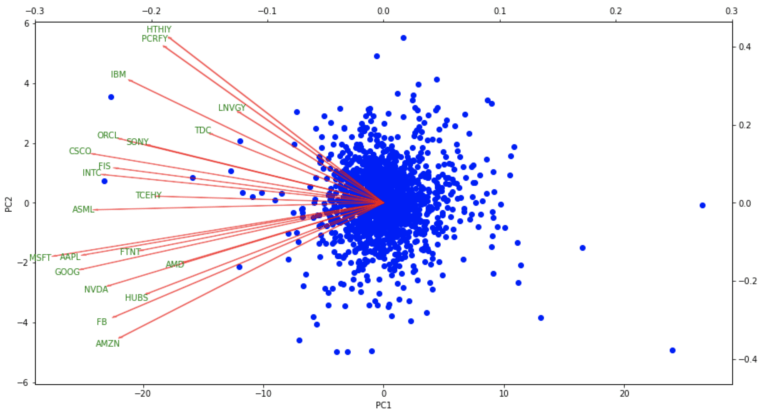
The biplot results show the distribution in the daily percentage change in the portfolio close prices projected onto the first two principal components. The loading vectors, for each of the constituent stocks, indicate how strongly each stock contributes to PC1 and PC2. Note that all the stocks contribute mainly to PC1. What is interesting are the correlations among stocks, illustrated by how closely the vectors are positioned with respect to each other. The large US tech giants (AMZN, GOOG, FB, AAPL, MSFT) are clustered in the lower left of the figure. On the other hand, more mature companies (IBM, PCRFY, HTHIY, etc) are clustered in the upper left of the plot.
For the remainder of this section, I will only be looking at the first two (most significant) principal components. As such, let’s select out these two columns from our results dataframe:
#isolate out just the first 2 principal components
dfPC12 = dfPCs2[['PC1','PC2']].copy()
I would now like to develop a simple procedure to identify outliers in our data. We will only use the first two principal components here, and define a zone of ‘normal’, or expected, behaviour. The logical question here is: how do we define normal behaviour? I will use percentiles to accomplish this; specifically I will define everything between the 0.5 to 99.5 percentiles as ‘normal’. Data point that fall out of this range will be flagged as outliers.
We can compute the necessary percentiles using numpy:
#0.5% and 99.5% percentiles
pc1_q = np.percentile(dfPC12.PC1.values,q=[0.5,99.5])
pc1_q
array([-9.60784353, 10.51759603])
#0.5% and 99.5% percentiles
pc2_q = np.percentile(dfPC12.PC2.values,q=[0.5,99.5])
pc2_q
array([-3.79466198, 3.38275052])
In the plane defined by PC1 and PC2, the zone of normal behaviour is shaped as an ellipse. We can use the percentiles calculated to determine the parameters for our ellipse:
#work out coordinates for PC1
u = np.mean(pc1_q)
a = pc1_q[1] - u

#work out coordinates for PC2
v = np.mean(pc2_q)
b = pc2_q[1] - v
We can now put together a simple plot that shows the PCA results, along with an indicator for normal daily percent changes in the adjusted close prices. The plot will consist of the results obtained on PC1 and PC2, which represent ~49% of all the variance in the dataset, along with an ellipse that separates normal observations from outliers:
#draw 2D ellipse in PC space
t = np.linspace(0, 2*math.pi, 100)
plt.plot( u+a*np.cos(t) , v+b*np.sin(t) , color='r' )
plt.grid(color='lightgray',linestyle='--')
plt.scatter(dfPC12.PC1.values,dfPC12.PC2.values, color='b')
plt.xlabel('PC1')
plt.ylabel('PC2')
plt.show()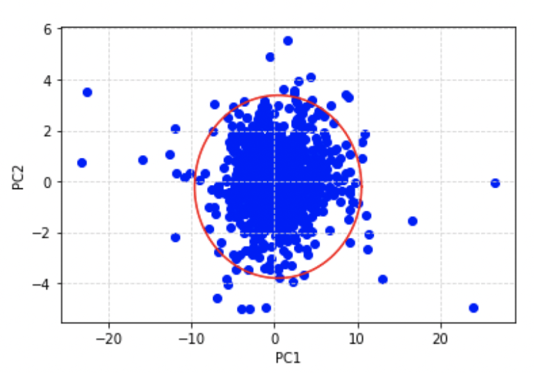
According to our definition for an outlier, each data point in the scatter plot above that lies outside of the red ellipse is an outlier. We can flag each of the occurrences in our results dataframe by making use of the outside_ellipse helper function we defined earlier:
#attach dates to the PC dataframe
dfPC12['Date'] = dfData.index.values[1:]

#attach boolean feature to flag outlier points
dfPC12['Outlier'] = [outside_ellipse(x,y,u,v,a,b) for x,y in zip(dfPC12.PC1.values,dfPC12.PC2.values)]
We can now enhance the previous plot by colouring each outlier detected green:
#isolate out the outliers
dfOutliers = dfPC12[dfPC12.Outlier].copy()
dfOutliers.reset_index(inplace=True,drop=True)

#draw 2D ellipse in PC space & show outliers
t = np.linspace(0, 2*math.pi, 100)
plt.plot( u+a*np.cos(t) , v+b*np.sin(t) , color='r' )
plt.grid(color='lightgray',linestyle='--')
plt.scatter(dfPC12.PC1.values,dfPC12.PC2.values, color='b')
plt.scatter(dfOutliers.PC1.values,dfOutliers.PC2.values, color='g')
plt.xlabel('PC1')
plt.ylabel('PC2')
plt.show()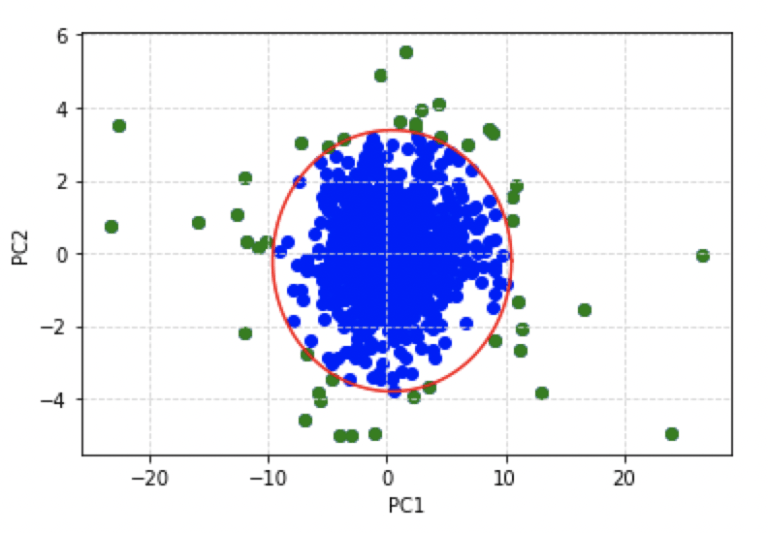
This is quite a satisfactory result: we have a simple scatter plot that can be used to represent the percentage change in adjusted close prices for all the stocks in our portfolio. The zone of nominal behaviour is clearly defined, and outliers can be easily visualised.
How do our detected outliers compare with the actual time series of close prices? Let’s produce another plot: this time with the original adjusted close prices for each stock, along with the outlier events represented as vertical blue lines:
#visualise stock prices overlayed with outlier time points
dfClose.plot(figsize=(18,12))
plt.vlines(dfOutliers.Date,0,4000)
plt.show()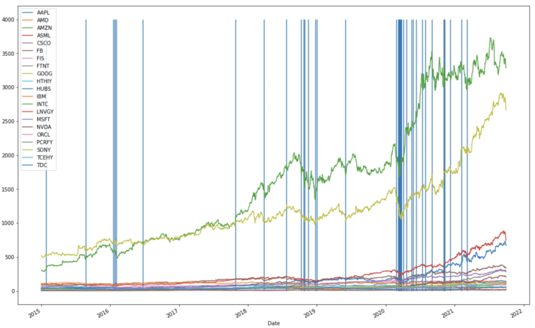
There are three clusters of outliers in the timeline, the first is centred around the beginning of 2016, and corresponds to the crash in the Chinese market of that year. The second cluster is centred towards the end of 2018, and is associated with the cryptocurrency crash of that year. The third cluster is focused just after the beginning of 2020, and correspond to the market downturns due to covid-19.
PCA Model Predictions
Up to this point, we have only been considering data available to the PCA machine learning model during training. Now we can build upon the results we already have, by testing our trained model on unseen data. We will obtain and transform adjusted close stock prices for the same 21 stocks, for the time period of 2021-10-02 to 2021-11-18. We can begin by loading in the desired data:
#read in data from yahoo
stocks = "AAPL MSFT AMZN FB GOOG NVDA FIS AMD TDC HUBS FTNT ASML INTC IBM ORCL CSCO " \
         "SONY HTHIY TCEHY PCRFY LNVGY"
dfData = yf.download(stocks, start="2021-10-02", end="2021-11-18")
The next steps will involve redoing the preprocessing discussed earlier for the training data:
#extract out adjusted close prices
dfClose = dfData['Adj Close'].copy()

#compute differences in close prices
dfClose = dfClose.pct_change().dropna()

#standardise the dataset with the scaler already fitted
closes = scaler.transform(dfClose)
We’re now in a position to obtain predictions for these data. We will transform them using the trained PCA model, and then project the results onto the training scores plot:
#transform data into PC space
pc = pca.transform(closes)

#draw 2D ellipse in PC space & show predictions
t = np.linspace(0, 2*math.pi, 100)
plt.plot( u+a*np.cos(t) , v+b*np.sin(t) , color='r' )
plt.grid(color='lightgray',linestyle='--')
plt.scatter(dfPC12.PC1.values,dfPC12.PC2.values, color='b')
plt.scatter(pc[:,0],pc[:,1], color='r')
plt.xlabel('PC1')
plt.ylabel('PC2')
plt.show()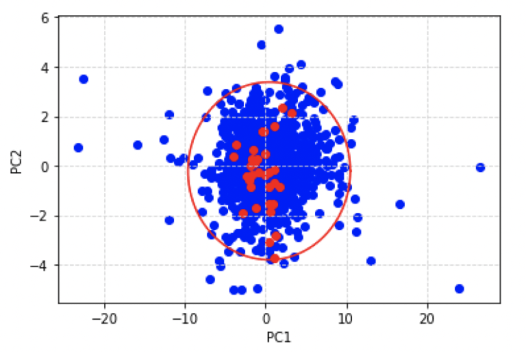
Here I have also included the ellipse of nominal behaviour we discussed earlier. The red points indicate the scores obtained for the unseen data we have just loaded, whereas the blue points illustrate the training data. It is apparent that the model does not predict outliers among the unseen data.
Let’s take a closer look at these results: for example, we can identify the datum that is located closest to the edge of the ellipse. This point corresponds to the day where the observed portfolio close prices deviate the most from nominal behaviour, given the historical record (i.e. training data). From visual inspection, we can see the point in the unseen data that lies closest to the ellipse boundary, also corresponds to the minimum in PC2:
#compute index
idx = int(np.where(pc[:,1] == np.amin(pc[:,1]))[0])
idx
12
So the record at index 12 contains the minimum for PC2. We can now check what day this corresponds to:
#what date corresponds to our maximum?
dfClose.iloc[idx].name
Timestamp(‘2021-10-21 00:00:00’)
Ok the day we are concerned with is 2021-10-21. Now let’s see which individual stocks contribute the most to the score for this day. To achieve this, we can do an element-wise multiplication between the eigenvectors and the standardised daily percent change close prices. We can subsequently sort the absolute values of the result, to yield a list of stocks by decreasing significance to the score:
#do element-wise multiplication
products = np.multiply(dfLoadings.loc[['PC1','PC2'],:].values,closes[idx,:])

#package up the components into a dataframe
dfProducts = pd.DataFrame(np.abs(products),columns=dfLoadings.columns,index=['PC1','PC2'])

#sort by value on PC1
dfProducts.sort_values(by=['PC1'], axis=1, ascending=False)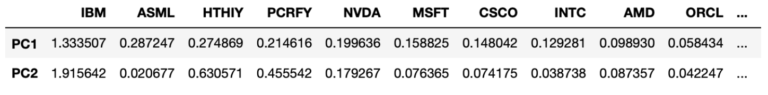
#sort by value on PC2
dfProducts.sort_values(by=['PC2'], axis=1, ascending=False)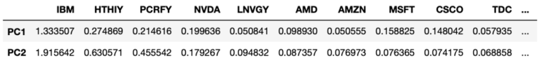
These results are interesting, we can see the stocks that contribute the most to the variance seen on 2021-10-21 include IBM, ASML, HTHIY, and PCRFY. These stocks encompass the top 3 contributing stocks for the first two principal components on this day. IBM tops the list for both PC1 and PC2, and this corresponds to the disappointing Q3 revenue report for the company released the previous day.
Final Remarks
In this article you’ve learned:
- The motivation behind principal component analysis (PCA), and when it was developed
- One possible derivation of PCA, and how to interpret the results from this algorithm
- How to implement your own PCA machine learning model in Python from scratch
- How to build a PCA model for stock portfolio analysis, and use the trained model to generate simple monitoring visualisations
I hope you enjoyed this article and gained some value from it. If you would like to take a closer look at the code presented here please take a look at my GitHub. If you have any questions or suggestions, please feel free to add a comment below. Your input is greatly appreciated.
Related Posts
Addendum
The curse of dimensionality refers to the effect that as the number of dimensions in a dataset increases, exponentially more samples maybe required to maintain the performance of a learning algorithm. This is due to the fact that the data space becomes exponentially sparse, as dimensions are added. To cover the higher-dimensional data-space, we need to corresponding increase our samples, which is normally not practical.
Pearson, K. 1901. On Lines and Planes of Closest Fit to Systems of Points in Space. Philosophical Magazine. 2 (11): 559-572
Hotelling, H. 1933. Analysis of a complex of statistical variables into principal components. Journal of Educational Psychology, 24, 417-441, and 498-520
Here we have assumed linearity. PCA is essentially a rotation operation on the data, which will only work properly if the intercept is removed. Removing the mean from the data accomplishes this.
Hi I'm Michael Attard, a Data Scientist with a background in Astrophysics. I enjoy helping others on their journey to learn more about machine learning, and how it can be applied in industry.
[…] the dataset has a very large number of features. Truncating the number of features, by applying a dimensionality reduction algorithm as a preprocessing step, may enhance […]
[…] distance becomes increasingly meaningless for higher dimensions. In these situations, applying a dimensionality reduction technique, as a preprocessing step, can […]
[…] to extract out the useful information from the predictive features, I apply PCA to the output from step 1. Since there are only 10 informative features in our data, I extract out […]