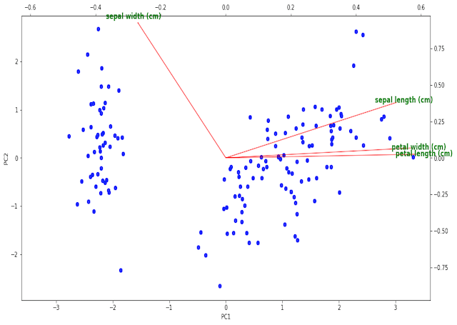
In this post we will cover the complete implementation of a biplot in Python. We will build this functionality from the ground-up, and cover why you might want to use such a plot with PCA.
Table of Contents
What is a Biplot?
In this post we will cover how to make a biplot in Python, and why you might want to do so. Biplots are used when performing Principal Component Analysis (PCA), where a dataset is projected onto a new coordinate basis to reveal underlying relationships. Please see my previous article here for a thorough exploration of PCA.
A biplot is actually a combination to two distinct illustrations:
- A scores plot: this consists of a scatter plot of the individual data points projected onto 2 principal components. Normally, these are the first two principal components (PC1 & PC2). This plot provides a means by which higher dimensional data can be visualised, and potentially interesting structure may be revealed.
- A loadings plot: this is a vector diagram that shows the magnitude and orientation of the eigenvectors for each feature in the dataset. The arrangement of these vectors illustrates the relationship between the original features and the principal components.
You can read more about scores and loadings plots here. By creating biplots, we can conveniently visualise the results of PCA in a manner that is easy to interpret.
Make a Biplot in Python
Unfortunately, there is no out-of-the-box biplot implementation for scikit-learn PCA. So let’s implement one ourselves! We can make a biplot in Python that depends on the following 3 packages:
- pandas as pd
- matplotlib.pyplot as plt
- mpl_axes_aligner
#function to produce biplot
def biplot(dfScores: pd.DataFrame, dfLoadings: pd.DataFrame) -> None:

    #create figure and axis objects
    fig,ax = plt.subplots(figsize=(15,8))

    #make a scores plot
    ax.scatter(dfScores.PC1.values,dfScores.PC2.values, color='b')
    #set x-axis label
    ax.set_xlabel("PC1",fontsize=10)
    #set y-axis label
    ax.set_ylabel("PC2",fontsize=10)

    #create a second set of axes
    ax2 = ax.twinx().twiny()

    #setup font dictionary
    font = {'color':  'g',
            'weight': 'bold',
            'size': 12,
            }

    #make a loadings plot
    for col in dfLoadings.columns.values:
        #where do our loading vectors end?
        tipx = dfLoadings.loc['PC1',col]
        tipy = dfLoadings.loc['PC2',col]
        #draw the vector, and write label text for col
        ax2.arrow(0, 0, tipx, tipy, color = 'r', alpha = 0.5)
        ax2.text(tipx*1.05, tipy*1.05, col, fontdict = font, ha = 'center', va = 'center')

    #align x = 0 of ax and ax2 with the center of figure
    mpl_axes_aligner.align.xaxes(ax, 0, ax2, 0, 0.5)
    #align y = 0 of ax and ax2 with the center of figure
    mpl_axes_aligner.align.yaxes(ax, 0, ax2, 0, 0.5)

    #show plot
    plt.show()
Python Coding Example
Let’s illustrate the use of the function with a simple example. We will make use of the predictors contained in the iris dataset. First, we will import all the required packages:
## imports ##
import pandas as pd
import matplotlib.pyplot as plt
import mpl_axes_aligner
from sklearn.decomposition import PCA
from sklearn.datasets import load_iris
from sklearn.preprocessing import StandardScaler
I will assume that the function biplot is implemented in the current environment. Now we can load in the data, and scale it such that each feature has a mean of 0 and standard deviation of 1:
#load in dataset
dfX,dfY = load_iris(return_X_y=True, as_frame=True)

#standardise the predictors
scaler = StandardScaler()
X      = scaler.fit_transform(dfX)
Now let’s perform PCA, and store the scores and loadings in pandas dataframes:
#apply PCA & package results in a dataframe
pca        = PCA()
scores     = pca.fit_transform(X)
dfScores   = pd.DataFrame(scores,columns=['PC'+str(i) for i in range(1,dfX.shape[1]+1)])
dfLoadings = pd.DataFrame(pca.components_,columns=dfX.columns,index=dfScores.columns)
Finally, we can make a biplot for these data using the function implemented earlier:
#produce biplot
biplot(dfScores, dfLoadings)
The illustration shows the scores indicated as the blue scatter points on PC1 and PC2, while the loadings are the red vectors labeled with green text. The tick marks on the bottom and left pertain to the scores, while the top and right ticks are for the loadings.
We can see 2 clearly defined clusters in the scoring plots, likely resulting from the different flowers categories. It is possible that the larger cluster to the right is actually composed of 2 clusters itself, which are almost superimposed on one another. This would make sense since this dataset consists of 3 classes of flower.
The loading vectors show that sepal length, petal width, and petal length all primary contribute to PC1 in the positive direction. Sepal width is nearly perpendicular to the other 3 features, and primary contributes to PC2. As such, we would expect sepal length, petal width, and petal length to be highly correlated, while sepal width should be a more distinct feature.
Final Remarks
In this article, I covered how to make a biplot in Python from scratch. I hope you enjoyed this post, and derived some value from it. Please feel free to leave a comment, your feedback is appreciated!
Related Posts
Hi I'm Michael Attard, a Data Scientist with a background in Astrophysics. I enjoy helping others on their journey to learn more about machine learning, and how it can be applied in industry.

Interesting!