Introduction

With any machine learning project, it is essential to measure the performance of the model. What we need is a metric to quantify the prediction error in a way that is easily understandable to an audience without a strong technical background. For regression problems, the Mean Absolute Error (MAE) is just such a metric.

The mean absolute error is the average difference between the observations (true values) and model output (predictions). The sign of these differences is ignored so that cancellations between positive and negative values do not occur. If we didn’t ignore the sign, the MAE calculated would likely be far lower than the true difference between model and data.

Mathematically, the MAE is expressed as:

MAE = \frac{1}{N}\sum_i^N|y_{i,pred}-y_{i,true}|

where y_{pred} are the predicted values, y_{true} are the observations, and N is the total number of samples considered in the calculation.

Python Coding Example

I will work though an example here using Python. First let’s load in the required packages:

## imports ##
import numpy as np
from sklearn.metrics import mean_absolute_error
import matplotlib.pyplot as plt

We can now create a toy dataset. For this example, I’ll generate data using a sine curve with noise added:

## define two arrays: x & y ##
x_true = np.linspace(0,4*np.pi,50)
y_true = np.sin(x_true) + np.random.rand(x_true.shape[0])

We can now plot these data:

## plot the data ##
plt.plot(x_true,y_true)
plt.title('Sinusoidal Data with Noise')
plt.xlabel('x')
plt.ylabel('y')
plt.show()
mean absolute error

Now let’s assume we’ve built a model to predict the y values for every x in our toy dataset. Let’s plot the model output along with our data:

## plot the data & predictions ##
plt.plot(x_true,y_true)
plt.plot(x_true,y_pred)
plt.title('Sinusoidal Data with Noise + Predictions')
plt.xlabel('x')
plt.ylabel('y')
plt.legend(['y_true','y_pred'])
plt.show()
mean absolute error

It’s evident that the model follows the general trend in the data, but there are differences. How can we quantify how large the differences are between the model predictions and data? Let’s address this by calculating the MAE, using the function available from scikit-learn:

## compute the mae ##
mae = mean_absolute_error(y_true,y_pred)
print("The mean absolute error is: {:.2f}".format(mae))

The mean absolute error is: 0.27

We find that the MAE is 0.27, giving us a measure of how accurate our model is for these data. We can plot these results with error bars superimposed on our model prediction values:

## plot the data & predictions with the mae ##
plt.plot(x_true,y_true)
plt.errorbar(x_true,y_pred,mae)
plt.title('Sinusoidal Data with Noise + Predictions')
plt.xlabel('x')
plt.ylabel('y')
plt.legend(['y_true','y_pred'])
plt.show()
mean absolute error

The vertical bars indicate the MAE calculated, and define a zone of uncertainty for our model predictions. We can see that this zone does encompass much of the random fluctuations in our data, and thus provides a reasonable estimate of the model accuracy.

Related Posts

0 0 votes
Article Rating
Subscribe
Notify of
guest

3 Comments
Oldest
Newest Most Voted
Inline Feedbacks
View all comments
adfs
adfs
1 year ago

wow great article

trackback

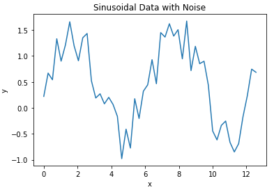
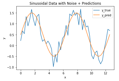
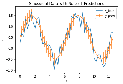
[…] strong resilience to outliers. This is in contrast to other metrics previous discussed, such as the Mean Absolute Error or Mean Squared […]

3
0
Would love your thoughts, please comment.x
()
x
Newsletter Signup