Area Under the Curve metrics represent a powerful way to assess the performance of a classifier. In this article, we will cover 2 versions of this metric, and illustrate scenarios when each version should be used. All code presented here is available on my Github.
Table of Contents
Area Under the Curve Explained with 2 Simple Examples – image by Author
Video
If you prefer video form content, you can watch me go through this material here:
Why use Area Under the Curve?
Common approaches for evaluating a classifier involve metrics such as accuracy, precision, recall, and F1. In addition to these, another powerful approach is to compute the Area Under the Curve (AUC). Here we’ll cover the AUC for the Receiver Operating Characteristic (ROC) and Precision-Recall (PR) profiles within the context of binary classification problems.
You might be wondering why do we need a AUC metric? Answering this requires a bit of understanding for how classifiers work. Under the hood, all classifiers are designed to predict discrete labels based on patterns learned on some training set. These discrete values are normally integers such as 0, 1, 2, etc. Machine learning models do not directly produce discrete values however, but instead yield probabilities for each class in the training data. A cutoff threshold is then used to convert these probabilities into the discrete class labels.
AUC metrics provide a way to evaluate the performance of a classifier, independent of the threshold choice. This enables us to have a much more robust sense for how well the classifier is working. The AUC value ranges from 0.0 (worst) to 1.0 (best).
In addition, the associated ROC or PR profiles can be used to optimally select a threshold value based on the problem at hand.
ROC AUC
The ROC plots the True Positive Rate (TPR) over the False Positive Rate (FPR). These quantities are given by:
TPR = \frac{TP}{TP+FN} (1)
FPR = \frac{FP}{FP+TN} (2)
where TP, FP, TN, and FN are the true positive, false positive, true negative, and false negative counts, respectively. Note that the TPR is the same as recall.
Let’s now create a simple dataset, do a train-test split, and use an xgboost classifier to attempt to model it:
from sklearn.datasets import make_classification
from sklearn.model_selection import train_test_split
from sklearn.metrics import (
    roc_curve,
    roc_auc_score,
    auc,
    precision_recall_curve,
)
from xgboost import XGBClassifier
import matplotlib.pyplot as plt

X, y = make_classification(n_samples=1000, n_features=8, n_classes=2, weights=[0.6, 0.4], return_X_y=True, random_state=42)

X_train, X_test, y_train, y_test = train_test_split(X, y, test_size=0.15, random_state=42)

model = XGBClassifier(random_state=42)
model.fit(X_train, y_train)
This was straightforward enough, now let’s attempt to analyse the performance of this model on the test set:
y_prob = model.predict_proba(X_test)
fpr, tpr, _ = roc_curve(y_test, y_prob[:,1])
plt.plot(fpr, tpr)
plt.title('ROC Profile for 40% Positives')
plt.plot([0,1], ls="--")
plt.ylabel("True Positive Rate")
plt.xlabel("False Positive Rate")
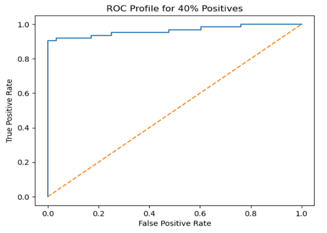
plt.show()Figure 1: ROC plot for the generated data. The blue curve illustrates the performance of the xgboost classifier, while the orange dashed line represents the baseline expected from random guessing
The blue curve in the plot above shows how the TPR and FPR vary, as the cutoff threshold varies from 0.0 to 1.0. For a perfect classifier, this curve would shoot to 1.0 for FPR = 0.0. The orange diagnonal line represents the performance expected for random guessing.
We can see that our classifier is functioning quite well: the TPR jumps above 0.8 even for very low FPR values.
To quantify the plotted results, let’s compute the ROC AUC. The ROC AUC is the area under the blue curve. We can do this with a single function call:
roc_auc_score(y_test, y_prob[:,1])0.9629765395894428
A result of ~0.96 shows that our classifier is functioning very well on the test set.
Now how can class imbalance affect the results above? If we look back to how we made our dataset, we introduced only a mild class imbalance of 0.6 (negative) to 0.4 (positive). There are many practical problems where the imbalance can be far more severe. How does our model perform then?
X, y = make_classification(n_samples=1000, n_features=8, n_classes=2, weights=[0.99, 0.01], return_X_y=True, random_state=42)

X_train, X_test, y_train, y_test = train_test_split(X, y, test_size=0.15, random_state=42)

model = XGBClassifier(random_state=42)
model.fit(X_train, y_train)

y_prob = model.predict_proba(X_test)
fpr, tpr, _ = roc_curve(y_test, y_prob[:,1])

plt.plot(fpr, tpr)
plt.title('ROC Profile for 1% Positives')
plt.plot([0,1], ls="--")
plt.ylabel("True Positive Rate")
plt.xlabel("False Positive Rate")
plt.show()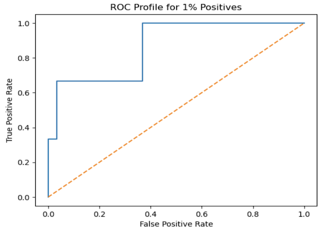
Figure 2: ROC plot for a highly imbalanced dataset
roc_auc_score(y_test, y_prob[:,1])0.8662131519274376
We can see model performance has dropped off, and understandably so. However, it is still not that bad, considering we now only have 1% positives.
But wait a minute, just how representative are these results now to the true performance of the classifier? More specifically, let’s look again at our definition for FPR (see equation 2 above). In general, small values of FPR are good, showing that we have a small number of false positives. However, in the scenario we have above, FPR will always be small since the 99% of our data consist of negative values (represented by the TN term in the denominator). As such, using the FPR does not make much sense in case.
PR AUC
For situations of high class imbalance, we can replace the FPR with precision, defined as:
precision = \frac{TP}{TP+FP} (3)
Precision measures the ability of the classifier to correctly identify positive values. Remember also that the TPR is the recall, which measures the ability of the model find all positive values.
The PR plot can then be generated in a manner that is analogous to what we did earlier:
precision, recall, _ = precision_recall_curve(y_test, y_prob[:,1])

plt.plot(recall, precision)
plt.title('PR Profile for 1% Positives')
plt.plot([0.01,0.01], ls="--")
plt.ylabel("Precision")
plt.xlabel("Recall")
plt.show()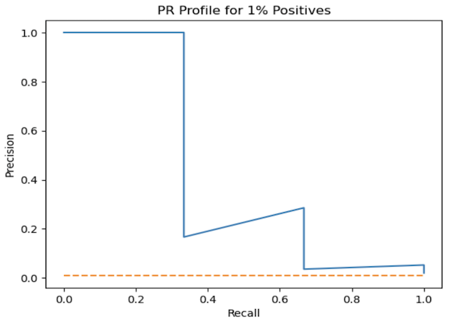
Figure 3: PR AUC plot for the highly imbalanced dataset. Note our baseline now is a horizontal line representing the positive ratio in the dataset
Here recall is now on the x-axis, and precision is placed on the y-axis. The better the classifier, the more the blue curve will shift to the top right (and cover more area in the figure). Our baseline is now presented by a horizontal line, set at the ratio of positives for our data (1%). This is the minimal precision possible, assuming we label all samples positive.
We can now compute the area under this curve:
auc(recall, precision)0.4234544695071011
This value is considerably lower than what we saw earlier, and gives a better sense for how the model is at finding positive values in the test set. Note that the PR AUC primarily reflects a classifiers ability to identify positive labels.
Conclusion
We worked through 2 different AUC metrics for evaluating a classification model. Both represent ways to measure model performance independent of the choice of cutoff threshold value.
- The ROC AUC is better suited for problems where class imbalance is not significant, and we are interested is correctly identifying both labels
- The PR AUC more appropriate for problems with significant class imbalance, and where we are primarily interested in identifying the positive (minority) class correctly. This is typically the case in many real-world problems such as fraud detection, spam email identification, etc.
I hope you enjoyed this article, and gained some value from it. If you would like to take a closer look at the code presented here, please take a look at my GitHub. If you have any questions or suggestions, please feel free to add a comment below. Your input is greatly appreciated.
Note I have started a New Monthly Newsletter! At the end of each month I will send out this free newsletter to each of my subscribers by email. This is the best way to stay on top of my latest content. Sign up for the newsletter here!
Related Posts
Hi I'm Michael Attard, a Data Scientist with a background in Astrophysics. I enjoy helping others on their journey to learn more about machine learning, and how it can be applied in industry.